A logo for Faktoria
Zawp needed a logo for a new location called Faktoria. I continued the work of the original designer.
When I began my internship at Zawp, a teacher from Finland was also there for a shorter while. She started the work on the Faktoria logo but didn’t have time to finish it so I picked up where she left off. The building where Faktoria will be has a crane so one of the ideas was to incorporate a crane into the logo. Initially another idea was chosen but that one ended up being scrapped. That’s when I moved onto developing the crane inspired logo. As with the Lacalde logo, I worked in Inkscape.
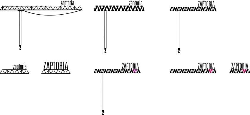
It turned out the crane in the building is a hall crane so I made the logo horizontal. I tried out a few ideas. (If you wonder why the name is different, it’s because for a while Faktoria was going to be Zaptoria).

The idea in the top left corner was chosen so that’s what I ran with. I used the font style from the Lacalde logo as I wanted to achieve a similar look. After a few feedback rounds on various versions, the logo started to find its final shape. I enjoy getting thoughtful feedback during the design process.

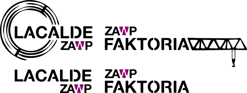
It was pointed out to me that the logo was a bit difficult to read this way so I switched the components the other way around.

Lastly I changed the font to the same one that’s used in the Zawp logo. I did the same for the Lacalde logo as well so that the logos would remain a matching pair.
