A logo for Lacalde
Zawp is opening a new place called Lacalde and it of course needs it’s own logo. I was given the task of designing one.
The logo design process begins with collecting information about the project. In this case, Lacalde is an empty factory that will be repurposed as an exhibition/event hall with workshop spaces for artists. Zawp will use it for their own productions and also rent the space out.
The name Lacalde comes from la calderia, which is the type of factory that was in the space before. The factory made washing machine parts by stamping metal. The material for stamping came in metal coils which gave me an idea: I would use the shape of the coil in the logo. So both the name and the logo will remind of the building’s past.
I worked in Inkscape and began by drawing a spiral.

This was just to familiarise myself with the shape and to see whether the spiral tool would work for my idea. I started changing the shape and playing around with it. I looked up pictures of metal coils online and continued working with the shape.
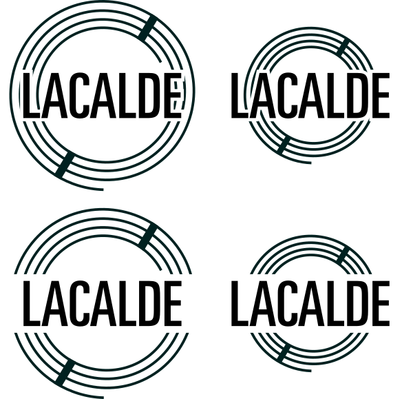
The tight coiling of the spirals caused a moiré pattern so I lowered the amount of turns.

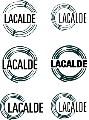
I made multiple versions as I kept working on the logo and occasionally asked for feedback from the people at Zawp.
After I had the general idea for the coil shape down I added the name of the place to the logo.

The spiral was too uniform so I tried different ways to make the shape more interesting. In the end I got the effect I wanted with the sculpting tool.

I tried out different spiral and text combinations.

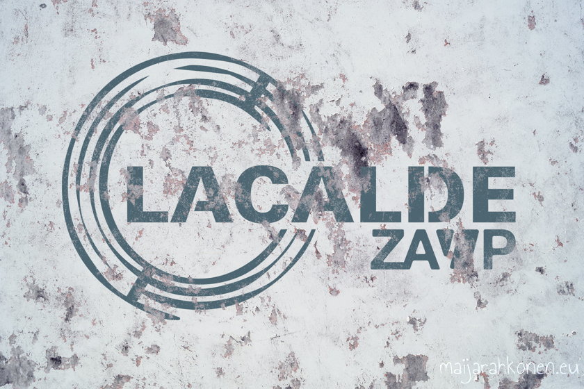
I added the Zawp logo since Lacalde will be a part of Zawp.

Eventually I arrived at two options, one heavy and one more delicate. The heavier one suited the image of Lacalde as a former factory better, the thinner design didn’t look industrial anymore.

I used a free mockup from Pixelbuddha to showcase the logo.
